Showing posts with label Studio Task 1. Show all posts

Monday, 26 September 2011

Branding and Identity


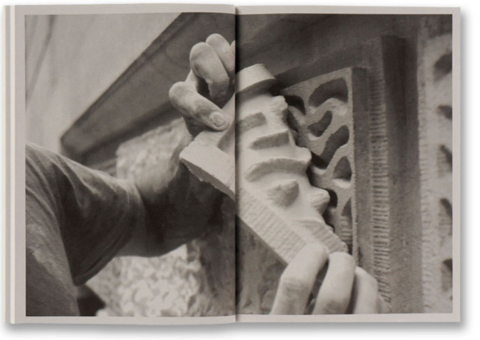
I really like the identity of this wood company, the picture helps to show what the company is about but the set of publications surrounding the tools are really effective, its obviously a high end print job therefore emulating quality service or product.

 
Project
Popeyes

Client
Popeyes

Redesign of fast-food chain's identity.
\\
"Popeyes chickens fucking sweet!" 
Also good re-branding on something that will have to be mass produced millions of time distributed all across America, but only using two colours will help costing. 


http://www.studioonfire.com/


Client:
Studio On Fire

Design:
Studio On Fire

Heather Black American Apparel 50/50 tee shirt screen printed in one colors says, “Bon A Tirer” – a print makers term for the print by which all others are judged. Translation means “Good to pull.” May be slang for something else outside of the print shop.

Packaging and Promotion


The designs on these bottle will have to be mass produced on a huge scale, they use a few colours so this is probably high quality grape, with expensve packaging. 


Client:
Erik Brandt
and the Urban Hillbilly Quartet
Design:
Studio On Fire
Illustration:
Studio On Fire


This is a really amazing shoe box but the process of printing onto wood must be very specialised and complex


Project
Big Ten
Identity for the U.S.’ oldest and largest Division I college athletic association.
\\
this is intresting promotion and packaging due to the logo being printed on different surfaces/materials for example plastic and metal as illustrated byt the above images.  

Publishing & Editorial


Project
Crazy from the Heat
Client
University of Texas Press
Collection of photographs by James H. Evans of the remote Big Bend region of West Texas.


This news paper although with some hight quality design as the image it is a relitivley low end print publication on a mass produced scale.

Lura is a newspaper sized Trimestral Publication
that focuses on educational events for children,
visitors of the Centro Cultural Vila Flor, GuimarĂ£es.

 \\
This is another example of a publication that is probably mass produced on a huge scale, using minimal colours and stock it is probably cheep to produces and distribute.


Creative Review a good exaple of high end printing for an editorial, the front page uses a thick stock and various specalist print methods its really intresting to see how the whole magazine is layed out with different pages being catagorised by the stock used.


Project
Max Lamb

Client
London Design Festival and HSBC Private Bank

Publication that celebrates the completion of a special piece by the designer for the bank’s St James’s office.
 \\
This publication use good quality stock but uses only uses black ink which would make it cheeper to print but it still manages to look like high end design.

Information & Wayfinding

This is the cafe of a design museum so naturally it is well designed, but of course as I'm focusing on the print aspect of the image I'm totally intrigued about how this is printed and then a applied to the wall.

An information booklet for the degree show at Nottingham Trent University, I like the design and layout of the work but its well printed and due to its purpose it will have had to be done on a large scale for distribution.

This image is similar to the top image but on a slightly larger scale and with more complicated design elements, but it still i ask the questin how?


 Ikea - Homemade is best, I took these pictures out of a creative review magazine I had but I think they illustrate the information graphics in a unusual way but it is also interesting to see the way it has been printed in a high end magazine.